How to Create a Divi Blog Post Template with Divi Theme Builder
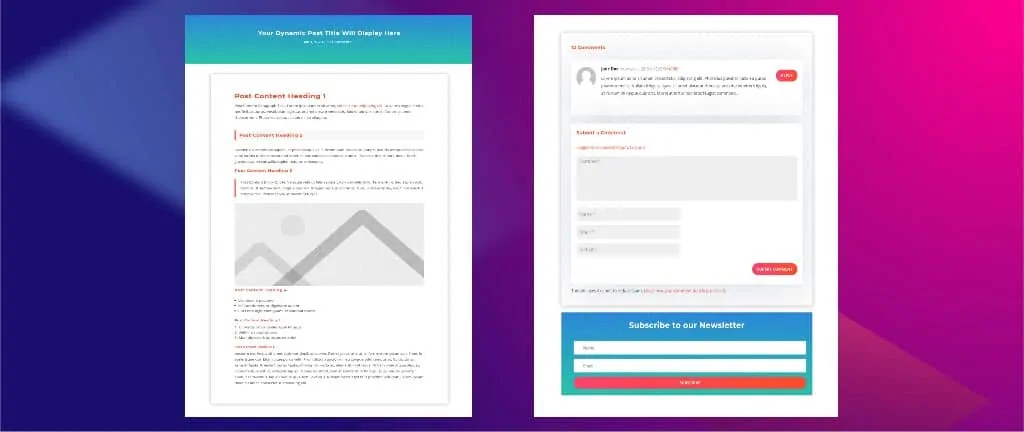
Elegant Themes recently released Divi 4.0, which includes a most-awaiting feature called Theme Builder.
Divi Theme Builder is a game-changer, it lets you create custom headers, footers, and custom body sections for your page(s) or post(s).
You can create a separate header, footer, and body section for each of your pages and posts.
Apart from creating custom headers and footers, another good use of Divi theme builder is to create a Divi blog post template with Divi Theme Builder.
So today, we are going to create a Divi blog post template with Divi Theme Builder.
The process is very simple and straight forward, so let’s get started before wasting any time.
Table of Contents
- Preview
- Download Divi Blog Post Template for Free
- Download For Free
- Thanks. You have successfully subscribed.
- Steps to Create a Divi Blog Post Template
- Step 1: Open Theme Builder
- Step 2: Add New Template
- Step 3: Add Custom Body
- Step 4: Build From Scratch
- Step 5: Create a Post Title Section with Gradient Background
- Step 6: Create a New Row
- Step 7: Add a Post Title Module
- Step 8: Post Title Module Settings
- Step 9: Create a New Section for Post Content
- Step 10: Add a Row
- Step 11: Add a Post Content Module
- Step 12: Set Padding and Box Shadow to Post Content Row
- Step 13: Add a New Section and Row for the Comment Module
- Step 14: Add Comments Module
- Step 15: Add Padding
- Step 16: Add Opt-in Box
- Frequently Asked Questions (FAQs)
Preview
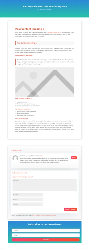
Here’s how Divi blog post template will look like.
Download Divi Blog Post Template for Free
Download Divi blog post template for free and save your time instead of building it from scratch.
To access the download link, you need to subscribe to our channel because this content is exclusive to our subscribers.
Subscribe below to unlock the content, and click on the Download button to download your freebie. Cheers. 🙂
Once you download Divi blog post template file, unzip it and then import the .json file to your Divi theme builder using the portability option.
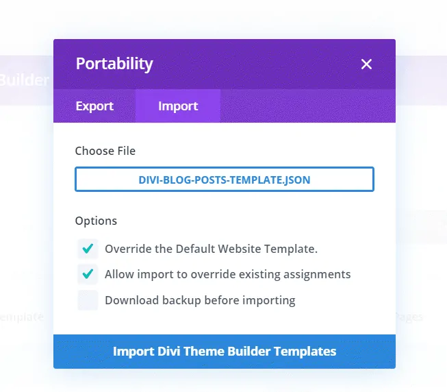
Once you import Divi blog post template to your Divi theme builder, you can easily modify it according to your site design and start using it immediately.
Requirements
The only requirement is that you should have the latest version of the Divi theme installed.
If you don’t have Divi theme, now is the best time to get it, because the latest version of Divi includes Dynamic Content, Divi Theme Builder and a lot more awesome features.
Steps to Create a Divi Blog Post Template
If you’re like me who is hungry to learn new things and is a DIY kind of guy, then follow the step-by-step tutorial below to create a Divi blog post template.
You don’t have to create anything from scratch if you have already downloaded Divi blog post template with the above download link and imported it to your Divi theme builder. But, I recommend you to follow the tutorial so you know how to make changes to your Divi blog post template.
Step 1: Open Theme Builder
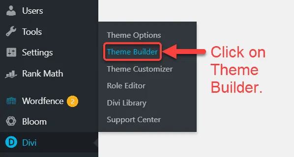
If you’ve updated your Divi theme to its latest version, then you should be able to see “Theme Builder” in your Divi menu. So scroll down to Divi menu and navigate over Divi menu and then click on theme builder.
Step 2: Add New Template
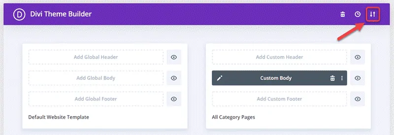
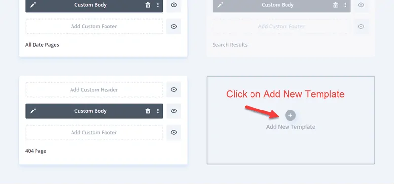
Click on the + icon as shown in the below screenshot and click on it to add a new template in your Divi theme builder.
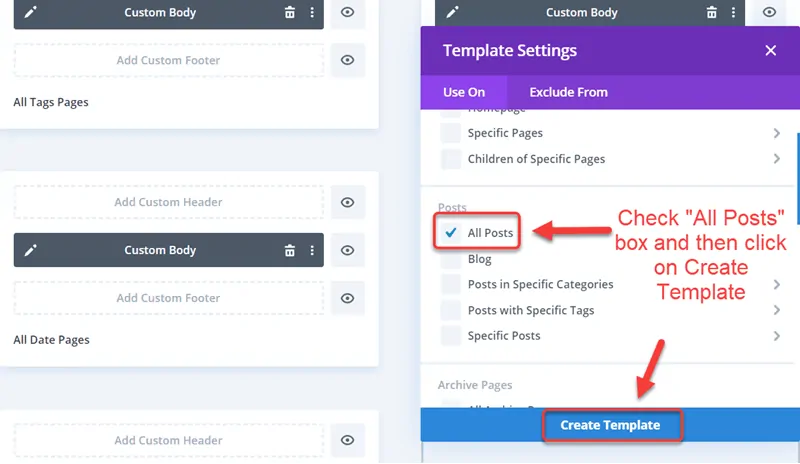
Once you click on the + icon which says “Add New Template” a new template settings window will pop up. In this window, navigate to posts section and select “All Posts” and click “Create Template.”
Step 3: Add Custom Body
You’ve created a new blog posts template for all your blog posts, but it’s blank, and you need to build it as you want.
We’ll only use a custom body module, and the header and footer will be the same as defined in the global template.
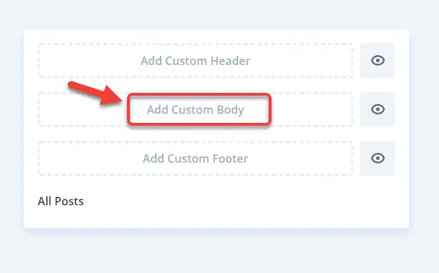
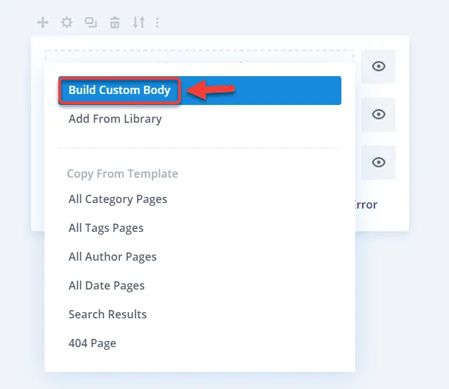
Once you click on the “Add Custom Body,” another pop up will appear where you need to click on “Build Custom Body” because we are going to create a custom post body section from scratch.
Step 4: Build From Scratch
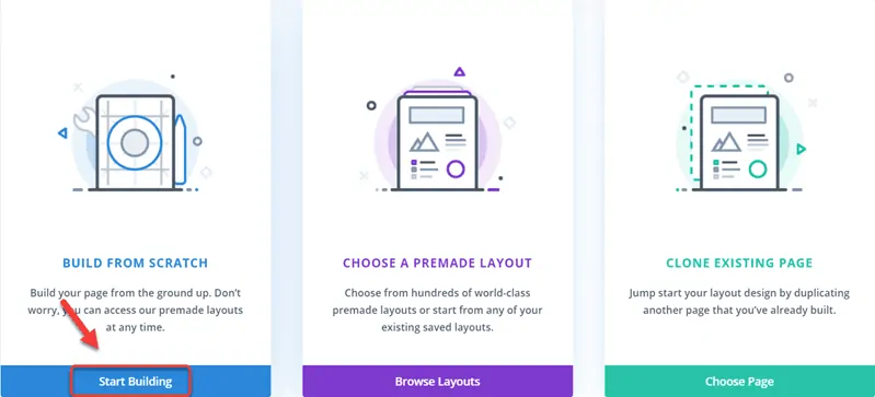
Navigate to the “Build from Scratch” box and click on the “Start Building” button.
Step 5: Create a Post Title Section with Gradient Background
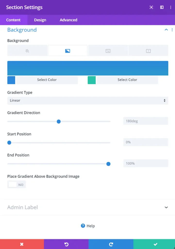
We’ll add a gradient background to the section which contains post title and post meta.
Gradient background details are:
Background Color 1: #2b87da
Background Color 2: #29c4a9
Gradient Type: Linear
Start Position: 0%
End Position: 100%
Note: This is the default gradient background, which will be automatically added when you click on “Add Gradient Background” in section settings.
Step 6: Create a New Row
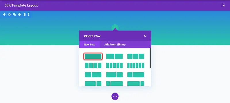
We are going to create a new row for creating a post title module.
Step 7: Add a Post Title Module
Search for the post title module and click on it to add it to the row you just created.
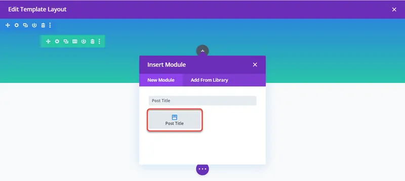
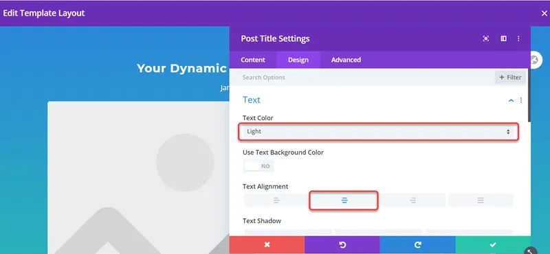
Step 8: Post Title Module Settings
Set Post Title Text Color to Light and Text Alignment to Center
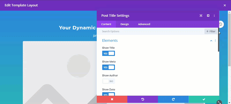
Show/Hide Post Title Elements according to your preference.
In Post Title elements settings, you can show or hide meta elements like author name, publish date, categories, comments count, and featured image according to your preference, or you can hide complete meta if you want.
We will hide the featured image in this example.
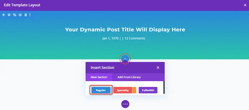
Step 9: Create a New Section for Post Content
Click on + icon and create a new regular section.
Step 10: Add a Row
Once you create a section, another popup will open, which will let you create a row, click on one column layout to create it.
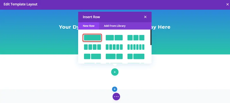
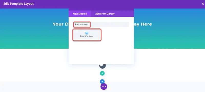
Step 11: Add a Post Content Module
Now another popup will appear, which will let you add a module. Search post content and click on it to add it to your post content section.
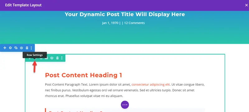
Step 12: Set Padding and Box Shadow to Post Content Row
Hover over the post content row and click on the gear icon to make some changes to it.
Add Box shadow to post content
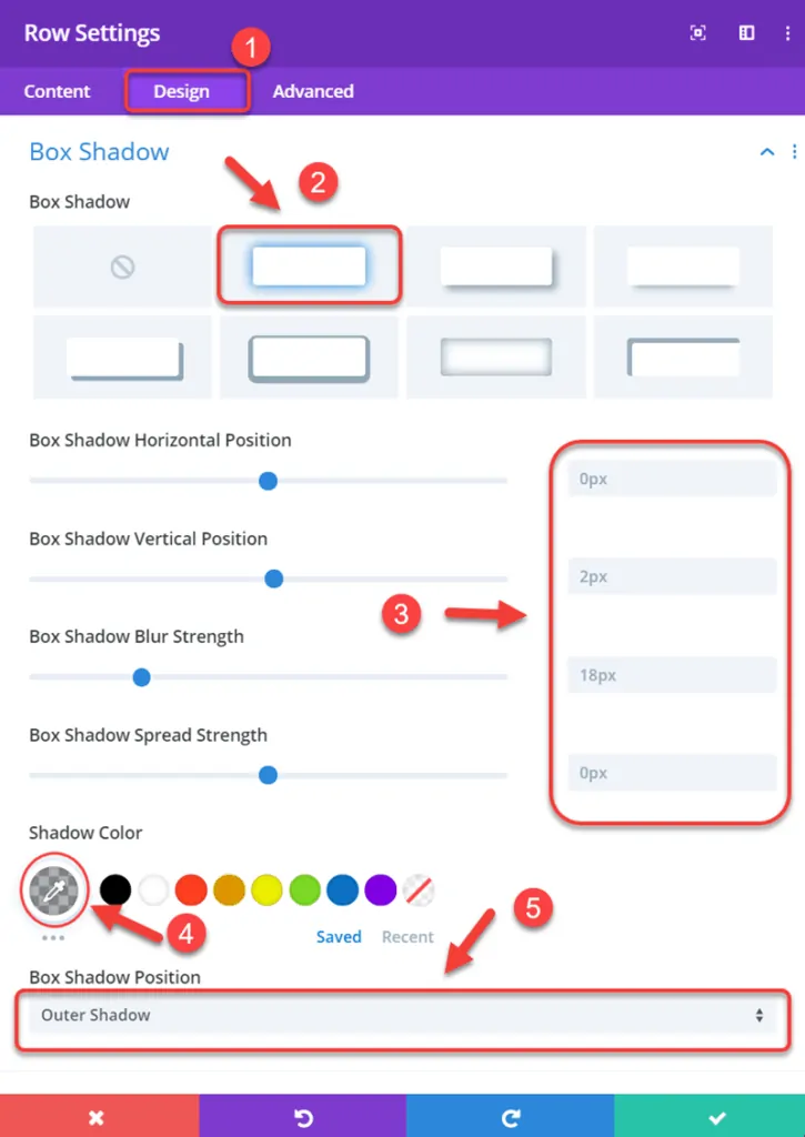
Hover over the post content row and click on the gear icon to open settings and scroll down to box-shadow inside the design tab.
Box shadow details.
Box shadow horizontal position: 0px (default)
Box shadow vertical position: 2px (default)
Box shadow blur strength: 18px (default)
Box shadow spread strength: 0px (default)
Shadow Color: (default)
Box Shadow Position: Outer shadow (default)
Add Border
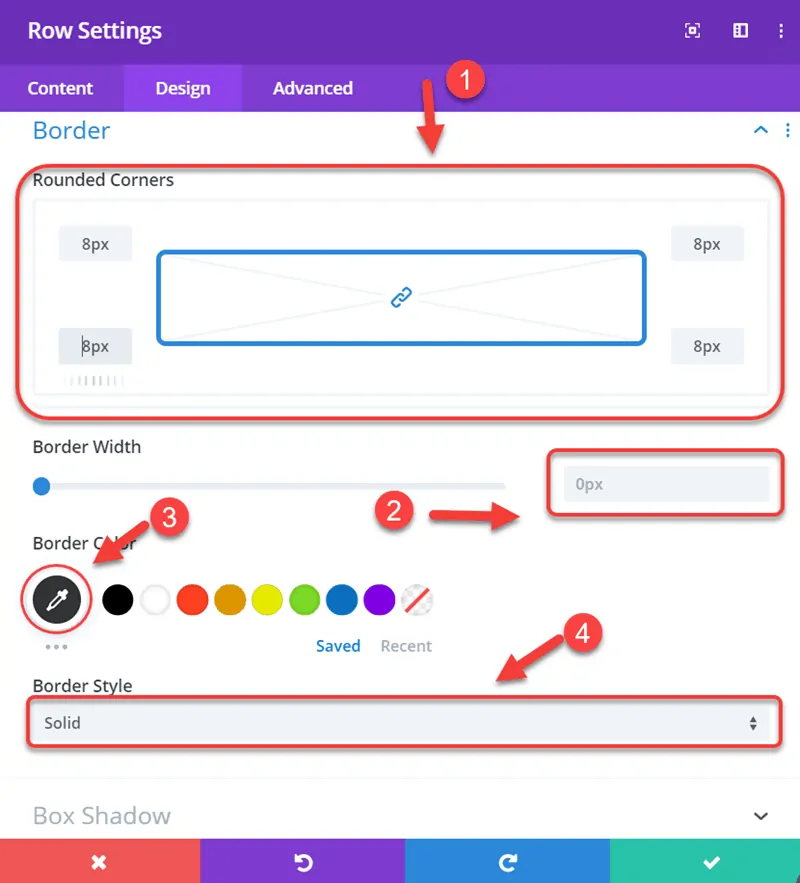
Now scroll to Border section and add following border.
Rounded Corners: 8px
Border Width: 0px
Border Color: Border width is 0px so border color doesn’t matter.
Border Style: Solid
Step 13: Add a New Section and Row for the Comment Module
Repeat the same process mentioned in steps 9 and 10 to add a new section and row respectively. We will use these to display our post comments.
Also, use the same box shadow settings from step 10 to add a box-shadow.
Step 14: Add Comments Module
Now, inside your row, click on the + icon and type comments in the search field to quickly locate the comments module and then click on it to add to row.
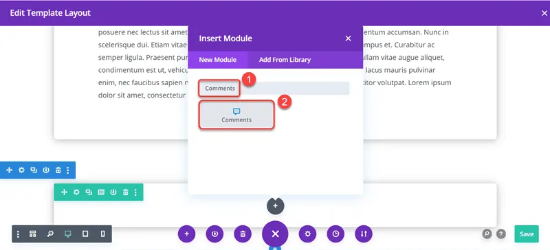
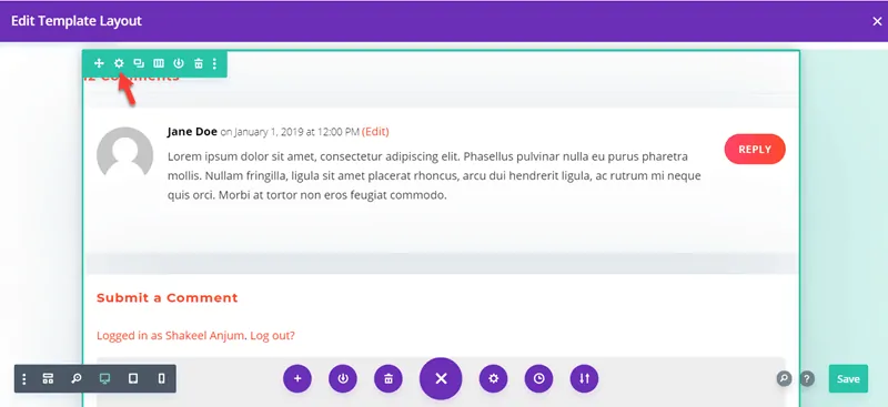
Once you add the comments module, it will automatically display the number of comments title and the actual comments in the boxed style.
Step 15: Add Padding
Because we are using a box-shadow in our row settings, so we also have to add padding, so the comments section looks good.
So hover over the row, which contains comments, and click on the gear icon to open row settings.
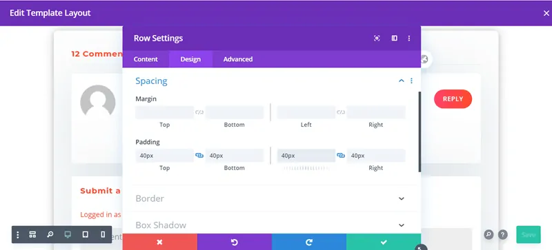
Now in the Design tab, scroll to the spacing section and add 40px padding to all sides (top, bottom, left, right).
Adding padding will make our comments section well organized with box-shadow.
Step 16: Add Opt-in Box
Create another row below the comments section to create an enticing opt-in box for your readers to subscribe to your mailing list.
Add a New Row
Click on the + icon and add a new one-column row below the comments section.
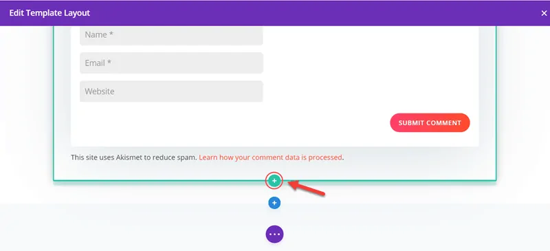
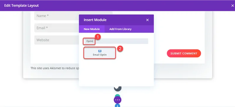
Add Email Opt-in
When you create a new row, it will ask you to add a module to it, so type Opt-in in the search field and click on Email Opt-in to add it.
And this is how your Opt-in box might look like when you add it for the first time.
This Opt-in is completely fine if you want to use it, but in this example, we’ll remove text and last name field and put the title above the fields section.
So hover over the Opt-in module and click on the gear icon to open Opt-in settings and make the following changes.
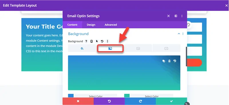
Change the Opt-in module background:
We’ll remove the simple background and add gradient background the same as like post title module we did in step 5.
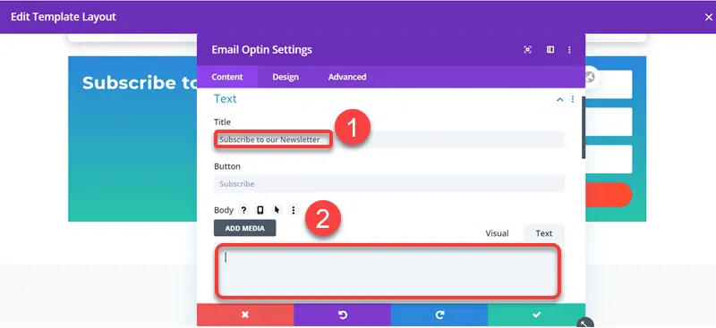
Change Title and Remove Body Text
Scroll to the Text section and change the title to “Subscribe to Our Newsletter” or anything else you want and remove body text.
Fields Settings
Scroll to the fields option and activate Use Single Name Field.

Layout Settings
Navigate to the Design tab and set “layout” to Body on Top, Form on Bottom.

Text Alignment
Navigate to the text option and set the text alignment to center.

Attach Your Preferred Email Marketing Account
In the content tab of email opt-in settings, navigate to the email account option, and select an email account and list to store your email. You can use MailChimp as your service provider or any other email marketing service provider.

Email Opt-in Final Result
So after making changes to the opt-in email module, it should now look like this. And you can easily change the background colour or subscribe button colour according to your brand colour in the email opt-in module settings.

That’s it.
If you’ve followed this tutorial, then by the end of this tutorial, you should have a basic Divi blog post template for all of your current and upcoming blog posts along with post title with a gradient background, post content, and comments section in boxed-style layout and an eye-catching email opt-in module.
I hope this article helped you, but if you face any trouble, you can ask me in the comments section below or contact me directly, and I’d be more than happy to guide you through the process. 🙂
If you liked this article, please share it with your friends and subscribe to the How-To WP Newsletter below to get the latest WordPress tips, tricks, and how-to tutorials directly into your inbox.
Sharing is Caring
Please share this article to spread the word. 🙂
Frequently Asked Questions (FAQs)
What is a blog post template?
A blog post template is a reusable format that can be applied to a WordPress post and allows you to focus on the post’s content.
How to speed up the Divi theme?
You can speed up the Divi theme by optimizing your images and using a caching plugin. You can do so by using a plugin, such as Autoptimize or WP Rocket.
Is Divi suitable for blogs?
Divi is an excellent theme for blogs because of its mobile-first design, one-click demo import, and remarkable flexibility.
Is the Divi theme slow?
No, there are no issues with using Divi, provided you follow all the speed optimization tweaks — using a caching plugin, optimizing your images, and opting a fast hosting.


Divi theme builder option is a game-changer. I can now easily able to change the blog posts designs, achieve pages, 404 pages, and category pages.
Absolutely.