How to Change Widget Size in WordPress: Blocks and CSS

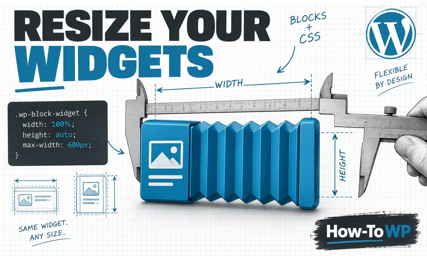
To change a WordPress widget’s size, first check its block settings and the width of the sidebar or footer column containing it. Use a small, targeted CSS rule only when those controls do not provide the size you need. A wider widget cannot create more space inside a narrow sidebar.
Choose the controls that match your theme
| What you see under Appearance | Where to work |
|---|---|
| Widgets | Open the relevant sidebar or footer area. A classic theme may use blocks here, or the older widget controls. |
| Editor | Open the template or template part containing the element. Block themes use blocks in these areas instead of the traditional Widgets screen. |
| A theme or page-builder layout panel | Use that tool’s sidebar, column, or container settings for the layout it controls. |
If you cannot find a Widgets menu, that alone does not mean your site is broken. Check the active theme and your account permissions. WordPress explains the distinction in its block-based Widgets Editor guide and block-theme overview.
Try block settings before adding CSS
- Open the area containing the widget and select the individual block. Use List View when several blocks are nested.
- For text size, look for Typography. For space inside or around the block, look for Dimensions and its available padding or margin controls.
- For an Image block, adjust its width while keeping its proportions. For the whole column, select the parent Group or Column and inspect its layout controls.
- Preview the page and save only the intended changes. Check a narrow screen as well as desktop.
Available controls depend on the block and theme. Padding adds space inside a box; margin adds space outside it. Neither setting creates a wider sidebar. See the official dimension controls and layout settings references.
Resize one widget with responsive CSS
For a block with an Advanced panel, add htwp-widget-size under Additional CSS class(es), without a leading dot. If several blocks make up one widget, a Group block can hold them and carry that class. Use a class specific to this widget so other parts of your site keep their existing appearance.
Put the following CSS in your theme’s supported custom CSS area. Classic themes commonly provide Appearance → Customize → Additional CSS. Block themes may expose Additional CSS through the Site Editor’s Styles options. Do not paste bare CSS into a paragraph or into functions.php.
.htwp-widget-size {
  box-sizing: border-box;
  width: 100%;
  max-width: 320px;
  height: auto;
  padding: 16px;
}

.htwp-widget-size img {
  max-width: 100%;
  height: auto;
}
This example makes the box fill the available space up to a maximum of 320 pixels. The padding is included in that width. If its parent has only 240 pixels available, the box can shrink to 240 pixels. Images inside it can shrink with the box while retaining their proportions. Change 320px to the maximum width you want, then preview.
For an older widget that has no custom-class field, inspect its outer wrapper on the public page. Use the element picker in your browser’s developer tools and look for a unique ID. For example, if the wrapper really is id="categories-3", replace .htwp-widget-size in both selectors with #categories-3. That ID is an example; copy the actual ID from your own page. A broad selector such as .widget can change every widget.
Change height without cutting off the content
Leave height: auto for a box that should grow with its contents. If you need a minimum amount of space, add a rule such as min-height: 180px;. This establishes a floor while allowing longer content to grow.
A percentage height is based on the containing block under CSS sizing rules; it does not mean “add this percentage to the widget’s original height.” In ordinary layouts, a percentage height may behave as auto when the parent’s height is not explicitly set. Empty values such as height: %; and width: px; are invalid. See the CSS height reference.
Change the text size separately
Use the block’s Typography controls where available. With CSS, target only the text you intend to change. For a classic Categories widget whose verified ID is categories-3, this example sets the list text size:
#categories-3 ul {
  font-size: 1rem;
  line-height: 1.6;
}
The theme may set a separate size on the links or heading. Inspect that element if it does not inherit the size. Our WordPress font-size guide covers the broader formatting task.
If the widget still looks wrong
| Symptom | What to check |
|---|---|
| Width does not change | Confirm the selector matches the actual wrapper. Inspect the parent’s width and any overriding theme rule. |
| Content spills out on mobile | Check fixed widths, long unbroken text, embedded frames, and child elements. An embedded service may need its own responsive settings. |
| Too much empty space | Remove an unnecessary fixed height or minimum height. Check padding and block spacing. |
| Only the editor looks different | Save the correct area, then check the public page. Clear the affected page’s cache if it still serves an older version. |
Keep a copy of the original CSS and undo just your new rule if needed. For broader layout work, use a staging site first. If the widget contains a footer logo or badge, follow our footer-image guide for placement and accessibility.
Resizing is a readability and layout improvement. It does not by itself guarantee faster loading, higher rankings, or more traffic.
For a practical sidebar example, follow our About Me widget guide, then adjust its container using the sizing methods above.